A landing page for Facebook ads has a few seconds to convince someone who was scrolling a moment ago. It is not your homepage, and it is not a brochure. It is one page with one job: turn the click into an enquiry.
Whether you need a landing page at all is a separate question; see lead form vs landing page. If you do, here is what a good one has.
A simple landing page layout that works
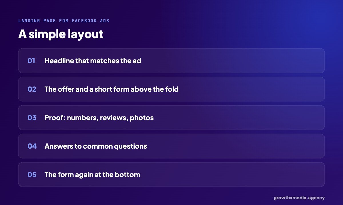
Top: a headline that matches the ad, the offer and a short form or WhatsApp button. Middle: proof and answers to common questions. Bottom: the form again. That is enough for most lead businesses.
9 things a good landing page for Facebook ads has
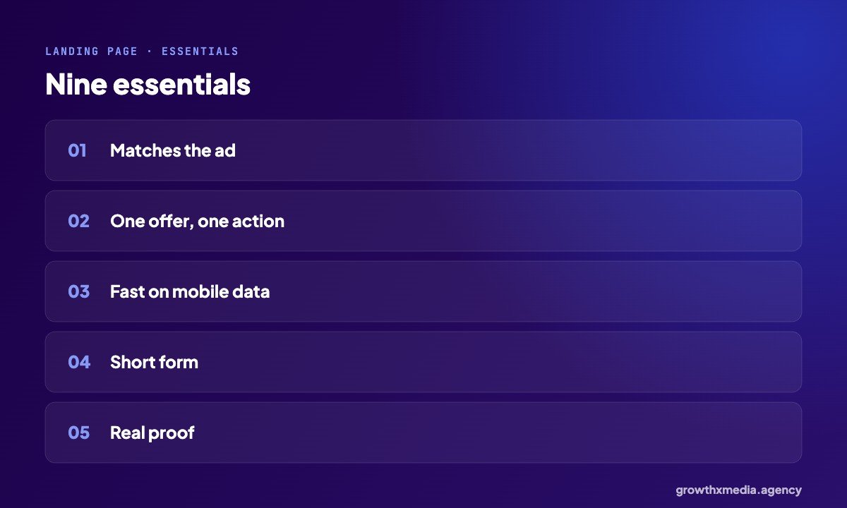
- It matches the ad. Same offer, same words, same look, so people know they are in the right place.
- One offer, one action. No menu, no distractions.
- It loads fast on mobile data. Most visitors are on phones.
- A short form. Name, phone and one or two questions.
- Real proof. Numbers, reviews, photos of real work.
- A WhatsApp or call option for people who prefer to talk.
- Answers to the top questions: price, timeline, location.
- A thank-you page that says what happens next.
- Tracking: the Pixel and Conversions API recording real leads.
Speed matters more than design
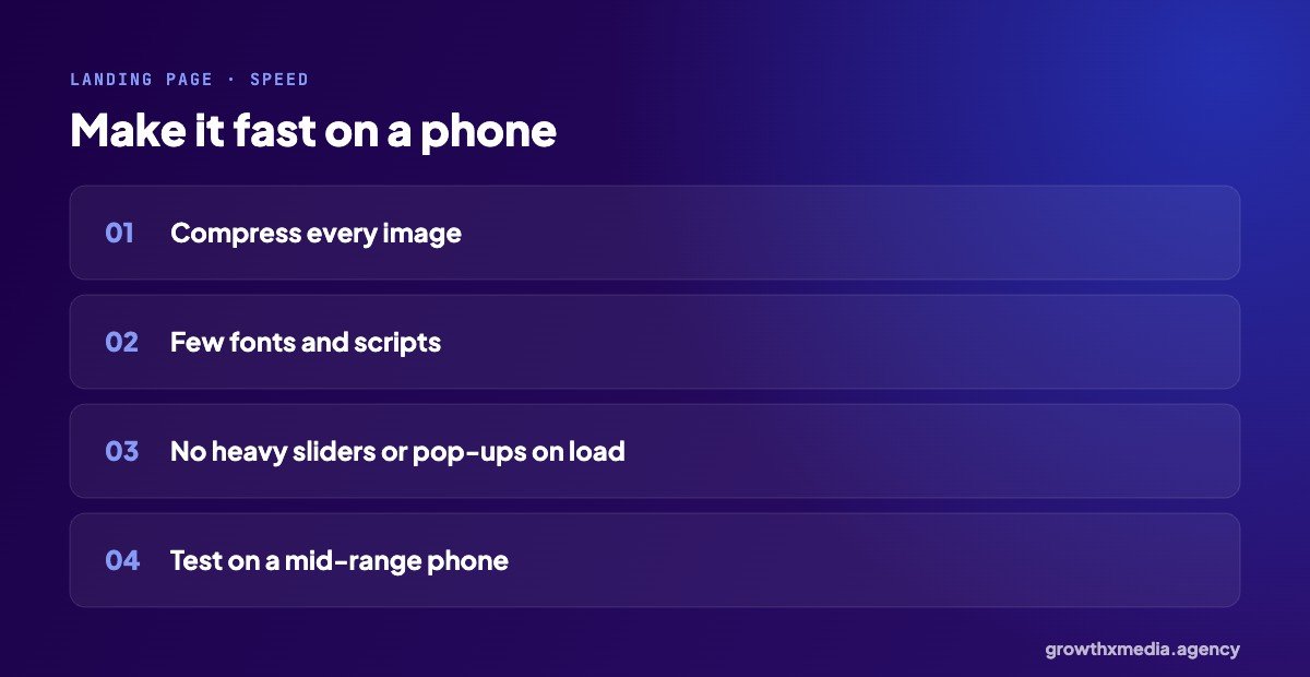
Many visitors from Facebook ads are on mobile data. Every extra second loses some of them. Compress images, limit fonts and scripts, and avoid heavy sliders and pop-ups on load. Test it on a mid-range phone, not just your laptop. Our Meta Pixel checklist covers the tracking side.
Common mistakes
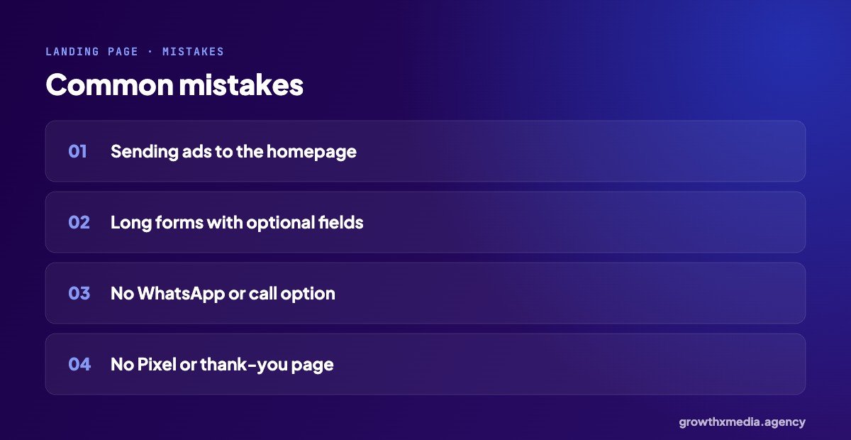
- Sending ad traffic to the homepage.
- Long forms with optional fields nobody needs.
- No WhatsApp or call option.
- No Pixel, or a thank-you page that can be reached without the form.
Does a landing page for Facebook ads need to be long?
Simple, familiar offers need short pages. High-value services that need trust, like interiors or treatments, can use longer pages with more proof. Either way, the form should be visible near the top.
Landing pages built for ads are part of our lead generation services. For copy that matches the page, see Facebook ad copy for lead generation.
A landing page for Facebook ads, section by section
1. Above the fold
Headline repeating the ad’s promise, one line on who it is for, the offer, and a form or WhatsApp button visible without scrolling.
2. What you get
Three to five short points on what the buyer receives: the product, the service, the timeline.
3. Proof
Real numbers, photos of real work, short reviews. Specific beats general: “₹18 per lead for six months” is more convincing than “great results”.
4. Questions
The four or five questions your sales team hears most: price, timeline, location, process, guarantees.
5. The form again
For people who scrolled all the way down, repeat the form or button at the end.
How to measure a landing page for Facebook ads
- Conversion rate: leads ÷ landing page views.
- Cost per lead from that page.
- Lead quality from your sales notes.
Compare all three against an instant form with the same ad. Sometimes the page wins on quality even when it loses on cost. Make sure the Meta Pixel is recording leads correctly before you compare.
Quick answers
Should the landing page have the main menu?
Usually no. Every link away from the form is a chance to lose the visitor.
How do I know if my landing page works?
Compare its conversion rate and cost per qualified lead with an instant form using the same ad.
Google’s free PageSpeed Insights shows how fast your page is on mobile. Or ask for a free ad account audit.
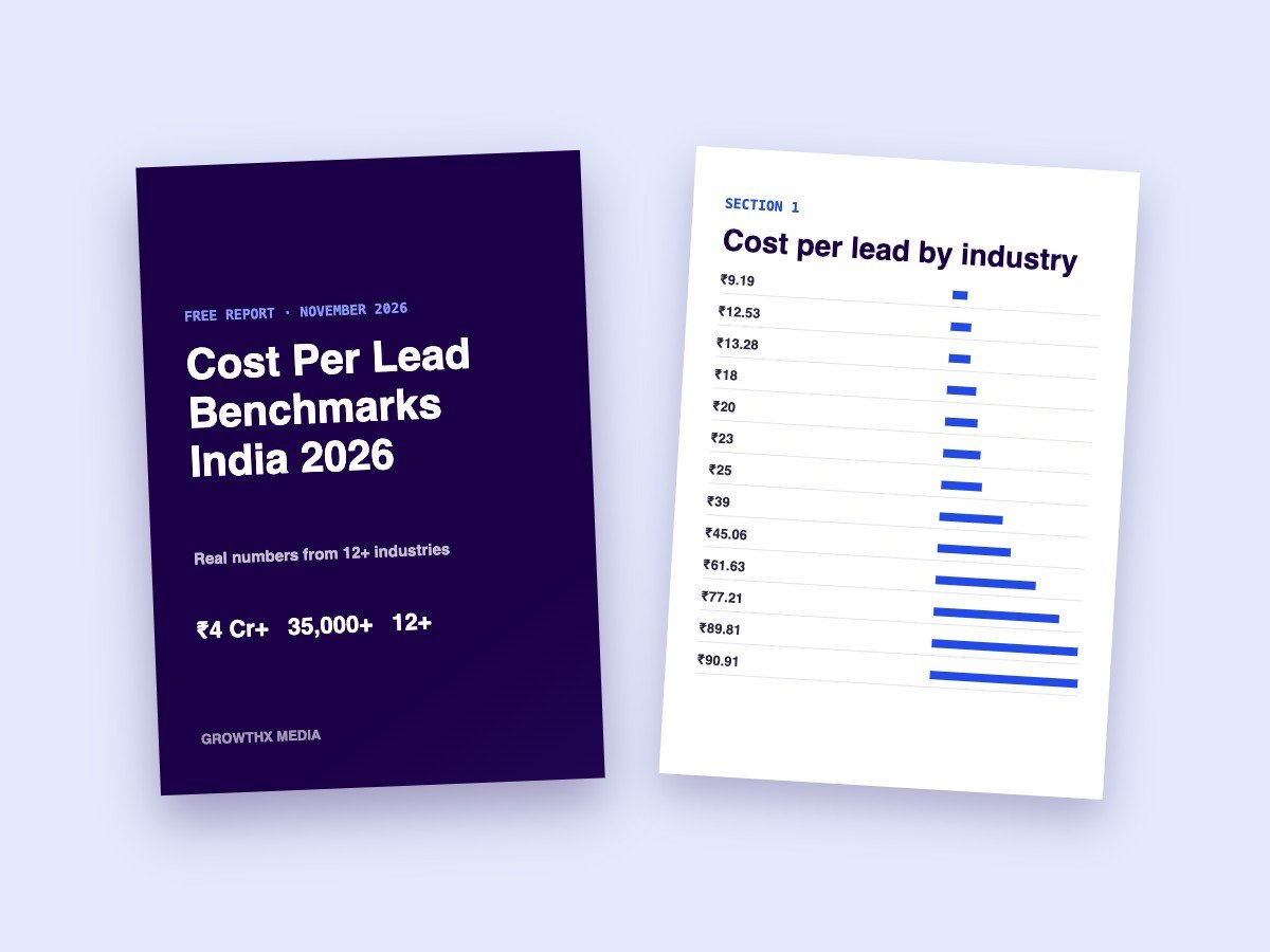
Want every benchmark in one place? Download our free cost per lead report with numbers from 13 industries.